Data Analysis & Visualization#
In this section we analyze and visualize the GBIF and IOER monitor data to explore the correlation between Passer domesticus observations and settlement density. The first step is to load and combine the two datasets we downloaded in the previous sections.
Understanding and Mitigating Bias in Citizen Science Data
When working with citizen science data, it is important to be aware of potential biases that may affect the results. These biases can arise from uneven geographic coverage, differences in the expertise of participants, differences in data collection methods, or selective reporting. Such factors may lead to the over- or under-representation of certain patterns, which can affect analysis and interpretation. Researchers should carefully assess these biases and use appropriate methods to account for them to ensure more reliable and meaningful conclusions.
These training materials cannot cover all the steps required to verify consistency and validity of results. There is excellent literature that illustrates all the necessary steps. For example, we have written about possible options for further data processing and internal consistency checks in a publication (Dunkel and Burghardt 2024).
This publication builds on previous excellent further research such as from Bowler et al. (2022), Lobo et al. (2023), and Kelling et al. (2019). See the References section at the end of this chapter for more information on these publications.
Load dependencies#
from pathlib import Path
import geopandas as gp
import mapclassify as mc
import matplotlib.pyplot as plt
import numpy as np
import pandas as pd
import rasterio
import seaborn as sns
from IPython.display import display
from rasterio.plot import show
from shapely.geometry import Point
from sklearn.linear_model import LinearRegression
from sklearn.metrics import r2_score
Define parameters#
base_path = Path.cwd().parents[0]
OUTPUT = base_path / "out"

FOCUS_STATE = "Sachsen" # Region Focus; Important: if you changed this,
                        # make sure you use the same as in Notebook 202

GBIF_SPECIES_OBSERVATIONS = OUTPUT / "occurrences_query.csv"
MONITOR_SETTLEMENT_AREA = OUTPUT / f"{FOCUS_STATE.lower()}_S12RG_2023_200m.tif"


CRS_WGS = "EPSG:4326"
CRS_PROJ = "EPSG:3035"
Prepare methods#
Load Region boundary
region_proj = gp.read_file(OUTPUT / f'{FOCUS_STATE.lower()}.gpkg')
Loading Raster Data
The load_raster_data() function opens and returns the raster dataset from the given path. This dataset will be used for sampling raster values later.
def load_raster_data(raster_path):
    """Load raster data and return the raster dataset object."""
    raster = rasterio.open(raster_path)
    return raster
Loading Species Data
The load_species_data() function loads species observation data from a CSV file and creates a GeoDataFrame with latitude and longitude coordinates. The data is loaded in WGS1984 Decimal Degrees format and then projected to CRS_PROJ (EPSG:3035).
def load_species_data(csv_path):
    """Load species observation data from CSV and return a GeoDataFrame."""
    df = pd.read_csv(csv_path, low_memory=False)
    geometry = [Point(xy) for xy in zip(df['lng'], df['lat'])]
    gdf = gp.GeoDataFrame(
        df, geometry=geometry, crs=CRS_WGS)
    gdf.to_crs(CRS_PROJ, inplace=True)
    return gdf
Sampling Raster Values
The sample_raster_at_points() function retrieves raster values at the locations of the species observation points. It checks if the point is within bounds and handles out-of-bounds points by assigning np.nan.
def sample_raster_at_points(raster, points):
    """Sample raster values at given point locations."""
    values = []
    for point in points:
        try:
            row, col = raster.index(point.x, point.y)
            value = raster.read(1)[row, col]
            values.append(value if value != raster.nodata else np.nan)
        except IndexError:
            values.append(np.nan)
    return values
Correlation Analysis
The correlation_analysis() function computes basic descriptive statistics for settlement density, allowing for a quick overview of the relationship between settlement density and species presence.
def correlation_analysis(species_gdf):
    """Perform simple correlation analysis between settlement density and species presence."""
    clean_data = species_gdf.dropna(subset=['settlement_density'])
    print("Correlation between settlement density and species presence:")
    print(clean_data[['settlement_density']].describe())
Visualize#
Visualization
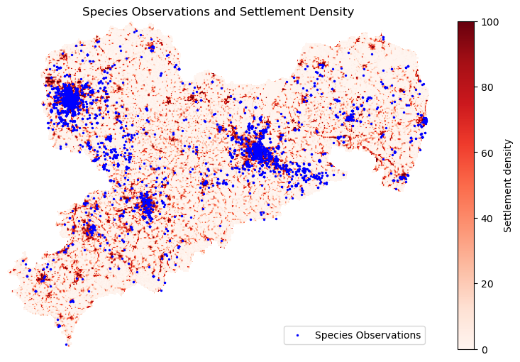
The plot_raster_obs() function coordinates the entire process, from loading the raster and species data to reprojecting and sampling raster values at species observation points. It also performs a simple correlation analysis between settlement density and species presence. Finally, it visualizes the results by plotting the raster data with species observations overlaid.
def plot_raster_with_observations(raster, species_gdf):
    """Visualize the raster data and species observations."""
    raster_data = raster.read(1)

    # Manually mask the nodata values
    masked_data = np.ma.masked_equal(raster_data, raster.nodata)
    fig, ax = plt.subplots(figsize=(10, 6))

    # Plot raster with show() from rasterio
    raster_image = show(
        masked_data,
        transform=raster.transform,
        ax=ax,
        cmap='Reds',
        title="Raster Data with Colorbar"
    )

    # Create a colorbar from the plotted image
    cbar = fig.colorbar(
        raster_image.get_images()[0], ax=ax, orientation='vertical')
    cbar.set_label('Settlement density')
    # Plot species observations
    species_gdf.plot(
        ax=ax, color='blue', markersize=2, label='Species Observations')

    plt.legend()
    plt.title('Species Observations and Settlement Density')
    ax.axis('off')
    plt.show()
def plot_raster_obs(raster_path, csv_path, bound_shape):
    """Load data and visualize the raster with species observations."""
    # Load data sources
    raster = load_raster_data(raster_path)
    species_gdf = load_species_data(csv_path)

    clipped_species_gdf = gp.clip(species_gdf, bound_shape).copy()
    clipped_species_gdf['settlement_density'] = sample_raster_at_points(
        raster, clipped_species_gdf.geometry)

    # Perform correlation analysis
    correlation_analysis(clipped_species_gdf)

    # Visualize the raster and species observations
    plot_raster_with_observations(raster, clipped_species_gdf)
plot_raster_obs(
    MONITOR_SETTLEMENT_AREA,
    GBIF_SPECIES_OBSERVATIONS,
    region_proj)
Correlation between settlement density and species presence:
       settlement_density
count         9259.000000
mean            49.888243
std             41.492324
min              0.000000
25%              2.603732
50%             49.501995
75%             96.925903
max            100.000000
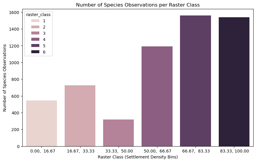
Study correlation#
species_gdf = load_species_data(
    GBIF_SPECIES_OBSERVATIONS)
raster = load_raster_data(
    MONITOR_SETTLEMENT_AREA)

clipped_species_gdf = gp.clip(
    species_gdf, region_proj).copy()
clipped_species_gdf['settlement_density'] = sample_raster_at_points(
    raster, clipped_species_gdf.geometry)

# Mask NaN values (exclude invalid species observations directly)
valid_points = clipped_species_gdf.dropna(
    subset=['settlement_density']).copy()

# Use mapclassify for quantile-based classification
classifier = mc.EqualInterval(valid_points['settlement_density'], k=6)
raster_bins = classifier.bins
class_labels = classifier.get_legend_classes(fmt="{:.2f}")

# Remove the brackets and customize the formatting
class_labels = [label.strip("[]()") for label in class_labels]

# Categorize settlement densities
valid_points['raster_class'] = np.digitize(
    valid_points['settlement_density'], raster_bins)

# Group by class and map labels to the classes
class_counts = valid_points['raster_class'].value_counts().reset_index()
class_counts.columns = ['raster_class', 'count']

# Map class labels directly without needing 'N/A' checks
class_counts['raster_bin'] = class_counts['raster_class'].apply(
    lambda x: class_labels[x - 1] if 0 < x <= len(class_labels) else None
)

# Filter out rows with None values in the 'raster_bin' column
class_counts_filtered = class_counts.dropna(subset=['raster_bin'])

# Visualize the results
fig, ax = plt.subplots(figsize=(10, 6))  # Use plt.subplots(), not plt.figure()

sns.barplot(
    x='raster_bin', y='count', data=class_counts_filtered,
    hue='raster_class', ax=ax, order=class_labels)  # Pass ax=ax to sns.barplot

ax.set_xlabel('Raster Class (Settlement Density Bins)')
ax.set_ylabel('Number of Species Observations')
ax.set_title('Number of Species Observations per Raster Class')

plt.show()
Save figure as svg and png
fig.savefig(
    OUTPUT / "graph.png", dpi=300, format='PNG',
    bbox_inches='tight', pad_inches=1, facecolor="white")
fig.savefig(
    OUTPUT / "graph.svg", format='svg',
    bbox_inches='tight', pad_inches=1, facecolor="white")
Prepare the data for regression, fit a simple linear regression, and compute the R² value.
X = np.arange(len(class_counts_filtered)).reshape(-1, 1)  # Settlement class index (0, 1, ..., n-1)
y = class_counts_filtered['count'].values  # Number of species observations

model = LinearRegression()
model.fit(X, y)

r_squared = r2_score(y, model.predict(X))
print(f"R² value: {r_squared:.4f}")
R² value: 0.9623
Interpretation#
An R² value (coefficient of determination) of 0.9623 means that 96.2% of the variance in the number of species observations can be explained by the settlement density.
What R² represents:
R² measures how well the independent variable (in this case, settlement density) explains the variation in the dependent variable (the number of species observations).
R² = 1 means a perfect fit, where the independent variable fully explains the dependent variable’s variation.
R² = 0 means there’s no explanatory relationship, meaning the independent variable doesn’t help explain the dependent variable at all.
What does this mean in practical terms?
An R² of 0.9623 indicates a very strong positive correlation between settlement density and species observations. While it doesn’t explain all the variability, it’s still a significant factor. The remaining 3.77% of the variation might be due to other factors not accounted for in your analysis, like environmental factors, climate, terrain, or other ecological variables, or sampling error. For example, a significant biasing factor in the GBIF data can be the number of observers. In our case, the number of observers is likely to correlate also with settlement density, which affects the results.
Limitations of R²
R² doesn’t indicate causality: While there’s a strong relationship, we can’t say that settlement density causes species observations. It simply means there’s a correlation.
Outliers: Be aware of any outliers, as they can have a disproportionate effect on the R² value. We have a small sample, which can easily be affected by outliers (e.g. a single species observer skewing the results).
Linear Assumption: R² assumes a linear relationship. If the relationship is non-linear, it might not be the best measure.
In summary, a 0.9623 R² suggests that settlement density is a very significant factor in explaining species observations for the Passer domesticus.
List of package versions used in this notebook
| package | python | matplotlib | seaborn | numpy | pandas | python | shapely | scikit-learn | mapclassify | geopandas |
|---|---|---|---|---|---|---|---|---|---|---|
| version | 3.9.23 | 3.9.4 | 0.13.2 | 2.0.2 | 2.3.1 | Not installed | 2.0.7 | 1.6.1 | 2.8.1 | 1.0.1 |
| package | rasterio |
|---|---|
| version | 1.4.3 |
References#
Alexander Dunkel and Dirk Burghardt. Assessing Perceived Landscape Change from Opportunistic Spatiotemporal Occurrence Data. Land, 13(7):1091, July 2024. URL: https://www.mdpi.com/2073-445X/13/7/1091 (visited on 2024-07-22), doi:10.3390/land13071091.
Diana E. Bowler, Corey T. Callaghan, Netra Bhandari, Klaus Henle, M. Benjamin Barth, Christian Koppitz, Reinhard Klenke, Marten Winter, Florian Jansen, Helge Bruelheide, and Aletta Bonn. Temporal trends in the spatial bias of species occurrence records. Ecography, 2022(8):e06219, August 2022. URL: https://onlinelibrary.wiley.com/doi/10.1111/ecog.06219 (visited on 2024-04-18), doi:10.1111/ecog.06219.
Jorge M. Lobo, Mario Mingarro, Martin Godefroid, and Emilio García‐Roselló. Taking advantage of opportunistically collected historical occurrence data to detect responses to climate change: The case of temperature and Iberian dung beetles. Ecology and Evolution, 13(12):e10674, December 2023. URL: https://onlinelibrary.wiley.com/doi/10.1002/ece3.10674 (visited on 2024-04-18), doi:10.1002/ece3.10674.
Steve Kelling, Alison Johnston, Aletta Bonn, Daniel Fink, Viviana Ruiz-Gutierrez, Rick Bonney, Miguel Fernandez, Wesley M Hochachka, Romain Julliard, Roland Kraemer, and Robert Guralnick. Using Semistructured Surveys to Improve Citizen Science Data for Monitoring Biodiversity. BioScience, 69(3):170–179, March 2019. URL: https://academic.oup.com/bioscience/article/69/3/170/5382641 (visited on 2024-06-11), doi:10.1093/biosci/biz010.